In this post, it's all about styling the pages and making it look consistent. I am no UI/UX expert and therefore, will keep the initial setup simply simple. I will go through on the CSS setup for the blog which able to fluid render on any devices and how Blazor helps the rendering as well.
Pre-requisites
- Bootstrap v4.3.1(only CSS) - For responsive web design, which able to render for mobile.
- Font Awesome v5.15.1 - For blog icons
- Google Fonts - For different form of fonts
- CSS - Customize Blog with custom styles
- C# (Where is Javascript?)
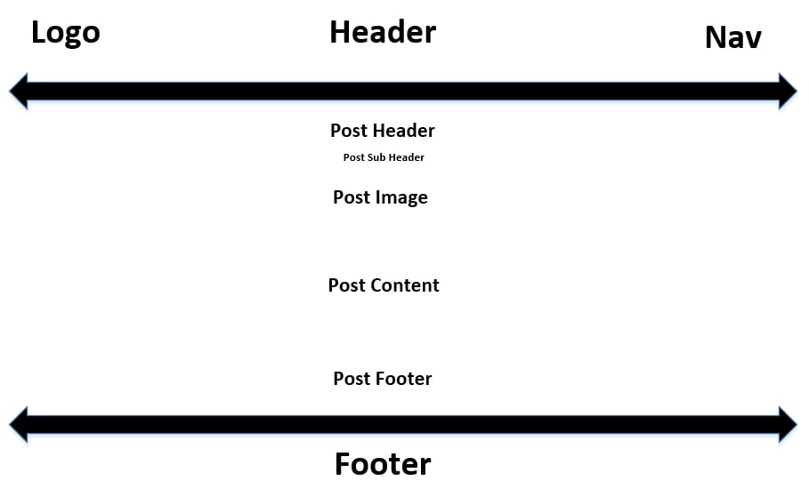
 The blog layout is separated in three sections which is header, content and footer.
Nothing complicated here and I want it to be manageable in future to extend my requirements without having to be worried of design
issues. I find it's easier to convert your view to simple UI sketch whether in a piece of blank paper/any sketching tools to get some
understanding how you would like your blog to be designed. From there, it's all much easier to come up with simple HTML design. Using the
design sketch above for my blog, it's now time to come with simple HTML & CSS design.
Switch to project structure, go to /Shared/MainLayout.razor:
As you see above, all I needed four
div to accomplish my simple design. If you also notice above,
I have separate the content of the div into reusable Blazor Razor components. I want to ensure that
the separated Blazor component will only be changed if modification is needed to comply Open-closed principle.
Sounds simple? Let's see how I styled them up with CSS.
Simple CSS to setup style for your blog
Switch to project structure, go to/wwwroot/css/app.css:
800px max-width seems reasonable to keep readability centralized rather than streching based on responsive design. However on mobile rendering, there is a catch here. If you have a child
div that
overflows, it will break the rendering and stretch fully. That's where media screen comes handy. Below shows on
how you can render for mobile which lesser than 800px. In my scenario, I would like to re-render it 100% again to
fit fully on mobile devices according to its device screen.
Setting up blog footer was indeed a big challenge because it sticks to the blog content when you zoom in and out. It does not render at the bottom of the page where most example out there are based on if your footer has fixed height. After searching through the internet, I came across this page by Philip Walton that demonstrates how we can achieve this with Flexbox.
Navigation for your blog
With simple Blazor basics as above, let's create a navigation with bootstrap that helps with responsive design. I've always appreciated the power of bootstrap especially with the given technologies out there to build websites, this has been a fundamental reason why devs less worry on ensuring it works on all desktop/mobile browsers. However, for most of the bootstrap functionalities, it requires Javascript to be able change state(e.g. onClick). So, do we need to restore Bootstrap Javascript to the blog? In short - NoLet's look on how we can solve DOM event changes with Razor directly. Firstly, to create a nice navigation, Navbar by Boostrap provides all the functionalities we need to render on desktop/mobile browsers which on screen changes, it will transform your navigation to . You can also refer to an example right here on GitHub.
Blazor has in-built NavLink component for navigations where it provides rich user experience to indicate which page you currently selected. It toggles an active CSS class based on the href matches using NavLinkMatch.
Next up, now that we created navigation bars, you will need to toggle the bars when page is minimized to change the DOM where you can collapse the selection. With Razor, you can do it as below:
Now that, we have base style setup. It's time to feed the layouts with contents. Remember, header, content and footer design!
Building page content
Blazor apps are built using components. A component is a self-contained chunk of user interface (UI), such as a page, dialog, or form. A component includes HTML markup and the processing logic required to inject data or respond to UI events. Components are flexible and lightweight. They can be nested, reused, and shared among projects.Firstly, to indicate a page is routable, a directive
@page added which also means when you call
/home, the component below will be loaded:
Page directives is only needed when you want to indicate a page is routable. You can still decorate it with HTML markup and reuse in a another routable page without a routable page.
Next up, let's look at one example on how you can inject the current year into HTML markup element with Razor.
Next up, how about passing data from parent to child component? I'm going to pass 'New Post' data from home page to post page.
Easy right? It's almost whatever you can do with Javascript, now you can do it on C#.
 Photo by